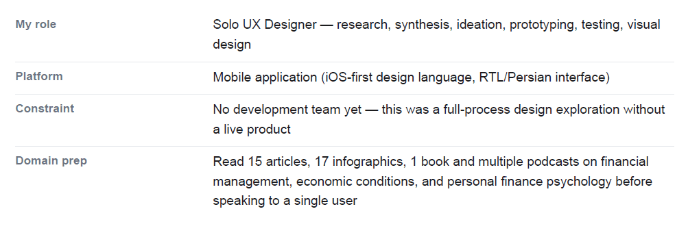
From Budgeting App to Fractional Property Investment Platform

Client
Amanj Academy
Role
Product design
Duration
12 weeks
Scope
User Research, Prototyping, Testing, Implementing
01 · The Brief
A generation was being squeezed out of their own financial future.
A sharp rise in the cost of living had pushed purchasing power dramatically downward, while the income of millions of people remained stagnant. People earning between 5 and 10 million tomans per month — enough to get by, not enough to get ahead — were watching inflation silently erode any chance of buying a home, a car, or investing for their family's future.
The brief: How might we help people earning 5–10 million tomans per month reach meaningful financial goals — like buying a car, a house, or building savings — in a system that feels designed to work against them?
The brief was deliberately open. It wasn't handed to me by a client — it was a self-initiated UX challenge. That meant I had the freedom to go wherever the research took me. And it took me somewhere I never expected.
02 · Research — I Thought I Knew the Problem. I Was Wrong.
201 people surveyed. 6 deep interviews. The data said something unexpected.

What the Research Was Designed to Find
I used two complementary methods. An online survey with 18 questions helped me find the target group, understand the scale of the problem, and gather general behavioural data. Then I ran 6 in-depth interviews — totalling nearly 6 hours — to build real empathy:
understanding not just what people did with money, but how it made them feel.

What the Research Actually Said

03 · The Pivot — Research Killed My First Idea
"I had gone into this project expecting to design a budgeting and expense-tracking app. The research killed that idea completely."
90% of interviewees and 65%+ of survey participants said they had no interest in recording expenses or budgeting. This wasn't apathy — it was a combination of emotional resistance (tracking feels like blame) and rational reasoning (low income makes tracking feel futile). Designing a budgeting app for people who fundamentally reject budgeting would have been solving the wrong problem entirely. Quick-action dispatch
Two Ideas Emerged. Only One Survived.
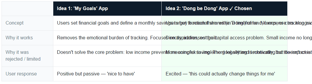
The Dong be Dong concept came from a real financial instrument: a 'Dong' is a fractional share of a property in local property law. The insight was this — if you can't afford a whole piece of land, buy 1 Dong out of 6. It's accessible, legally sound, and gives people a real, growing asset rather than a savings account that inflation will erode anyway.
04 · Persona — Designing for AmirAli
AmirAli, 35. Married. Fixed salary. Dreams, but no plan.
AmirAli doesn't record expenses — not because he's disorganised, but because tracking his spending makes him feel guilty and limited. He has big goals: buying a house, a car, investments. But without a concrete plan, these stay as wishes. He makes impulsive purchases, eats out frequently, and saves very little each month despite trying hard. He knows financial knowledge matters — he just doesn't have it or know where to start.
The core tension: AmirAli wants financial progress but the available tools (budgeting apps, expense trackers) make him feel worse, not better. He needs something that replaces guilt with momentum.

What AmirAli needs from Dong be Dong:
A way to invest without needing to save a large lump sum first
Transparency — where is my money, what does it own, what is it worth today?
Motivation through visible progress, not guilt through visible spending
Safety — in an unstable economy, he needs to feel his investment is protected
Simplicity — he is not a financial expert and doesn't want to become one
05 · Design Direction — Honest About the Hard Parts
Before designing a single screen, I conducted a SWOT analysis on the concept. This is a step many designers skip — but for a product dealing with people's money and legal property, ignoring risks would have been irresponsible.
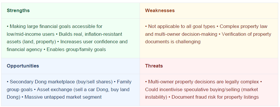
Design decision: I didn't try to hide or solve the threats with UX alone. Instead, I designed the identity verification and document authentication flows into the core user journey — not as afterthoughts, but as trust-building moments.
06 · Design & Prototype — Building the System
User Flow — Four entry points, three investment types, one cohesive system.
The flow architecture was the most complex part of this project. The product needed to handle three very different investment types (land/farm, car, and safe box savings) while maintaining a single, coherent experience. Each type had unique legal steps: land purchases required identity verification, document review, and an in-person meeting; car purchases needed detailed specification review; safe boxes required only savings management.
Information Architecture — Site Map
I designed the app around four primary sections: Profile, Reports, Market, and Safe Boxes. The Market section was the most complex, containing buy and sell flows for land/farms and cars, each with dedicated listing, purchase process, and customer management subsystems.

High-Fidelity Wireframes
I built wireframes for every key state: splash, registration, onboarding, home (empty and populated states), safe box creation, deposit flow, reports, market listings, authentication gates, and the ad-posting flow for sellers.Each screen was designed with an RTL (right-to-left) Persian interface in mind.
07 · Testing — When 70% Fail, That's Not a Bug. That's a Signal.
10 users tested the prototype. The results were humbling.
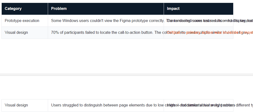
After building the prototype in Figma, I sent the link to 10 users via Maze for remote usability testing. Two categories of problems immediately surfaced.

08 · Iteration — Fixing What the Users Showed Me
Three specific interventions, driven by test data.
Fix 1 · The Safe Box Screen
The deposit button was buried and the safe box inventory was visually indistinct. I relocated the deposit button to a more prominent position, increased the font size for the safe box balance, and added transaction statistics to give users an immediate sense of their financial activity at a glance.

Fix 2 · The Market Listing Screen
The market cards had poor visual hierarchy — users couldn't quickly identify the key information (property type, price per Dong, total Dongs available) or find the action button. I reorganised the element hierarchy, made the CTA button significantly more visible, and added real photography to the listings so the investment felt tangible and trustworthy.
09 · Visual Design — Trust Through Clarity
The visual design language was built around a single priority: making financial information feel approachable and trustworthy rather than intimidating. I chose a blue-cyan palette that signals technology and reliability, paired with soft 3D illustrations that give the app warmth without sacrificing seriousness.
Logo Design Logic
The logo was designed from four symbolic components: a square (earth, steps forward), 6 grid cells (representing 6 Dongs, full ownership), a road (your path to goals), and a house/car icon (the physical goal achieved). Together they form a geometric structure that visually communicates the product's entire premise.

10 · What I Learned — The Uncomfortable Stuff
"The most important skill I developed wasn't how to design a screen. It was learning
to embrace when the research says you're wrong."
Assumptions are hypotheses, not facts
I went in expecting to build a budgeting tool. Within the first few interviews, I realised the target users didn't want one — not because they were lazy, but because tracking expenses triggered shame and anxiety. That emotional dimension of financial behaviour wasn't in my initial assumptions at all. It completely reshaped the product.Different perspectives are the point
Across 6 interviews, the variety of people's relationships with money was striking. Some saw recording expenses as useless. Others saw it as essential. Some wanted to invest; others wanted to simply survive the month. Research isn't about finding one truth — it's about understanding the spectrum and designing for the most impactful segment.
Good UX doesn't eliminate hard problems — it makes them navigable
Dong be Dong's hardest challenges — legal document verification, multi-owner property decisions, fraud prevention — aren't UX problems. They're systemic ones. But UX can build the trust, transparency, and clear process that makes users feel safe engaging with them anyway. That was the design challenge: not solving law, but designing confidence.
Shipping is a design decision too
This product doesn't yet have a development team, which means it exists as a fully designed, research-backed, tested concept waiting for the right moment. That's a real-world constraint — and part of what I learned is that a designer's job isn't always to ship. Sometimes it's to de-risk a product enough that someone else can confidently build it.
11 · Future Vision
The research surfaced features that go beyond the v1 concept — and that I would prioritise in a second design sprint:
Family goal pools: Multiple family members contributing toward a shared property goal, each committing to a fixed monthly amount
Dong marketplace: A secondary market where users can sell their Dong shares —creating liquidity and long-term engagement
Asset exchange: Trading a Dong from one asset class (e.g. car) for a share in another (e.g. land) —without converting to cash
Advisor integration: Connecting users with financial advisors who can help them understand which Dong investment suits their risk tolerance
This case study is about more than a product.
It's about what happens when you commit fully to listening before designing. The product that emerged — fractional property investment for an underserved middle class — was unrecognisable from where I started. That gap, between the assumed problem and the real one, is exactly where the most valuable design work lives.

