Redesigning the Hotel Booking Experience to Win Back Online Conversions

Client
Eghamat24
Role
UX Design, Product Design
Duration
10 weeks
Scope
UX Research, UI Design, Product, Marketing
THE PROBLEM
Online bookings were declining — and competitors were winning.
Eghamat24, one of Iran's first and most established online hotel reservation platforms, was facing a critical business problem: the share of online reservations was steadily shrinking compared to offline and phone bookings. Meanwhile, competitors like Snapp! Trip and Alibaba.ir were pulling users away with smoother digital experiences.
The consequence was direct: every user who called to book instead of completing the flow online was a signal of a broken experience — and a real hit to company revenue.
My challenge wasn't just to redesign a form. It was to understand why users were abandoning the digital flow, and then build a solution grounded in evidence.

Context & Scope
My role Sole UX designer on this project, working alongside the
UI team, Product manager, Product owner, Marketing and development teams.
Platform Web (desktop & mobile) + native mobile application
Key constraint Internet disruptions in Iran (September 2022) prevented online usability
testing tools from functioning — I had to adapt my testing method on the fly.
Constraint 2 A secondary sprint involved a Tour Reservation product that had to ship
urgently to meet peak-season demand, requiring a leaner, faster process.
I didn't assume I knew the problem. I went looking for it.
The reservation process had been built to serve everyone — B2C travellers, B2B travel agencies, and large corporate clients. In practice, this meant it was optimised for nobody. There were no defined user personas, which made it impossible to personalise the experience or even prioritise what to fix first.
Research Methods:
What the Research Revealed
The data pointed to a single root cause: the platform treated all users identically, despite them having fundamentally different goals, technical literacy levels, and decision-making criteria. Analytics confirmed that 88% of traffic was mobile — yet the booking form had been designed with a desktop-first mindset.

Key Insight: The assumed problem was 'the form is too long.' The real problem was 'we're showing the same form to a solo traveller, a travel agency, and a corporate HR department — and expecting all three to convert.'

Three personas. Three completely different problems.

I used Google Analytics data to validate each persona — confirming the 64% male / 36% female split, the dominance of Android (339K users) over iOS (114K), and the 25–34 age bracket as the largest segment. These weren't assumed archetypes — they were grounded in real platform data.

We mapped every competitor's booking flow to found where we were losing!
I benchmarked the booking form step across Snapp! Trip, Alibaba.ir, Jabama, and Flightio. The analysis revealed a critical structural weakness: Eghamat24 was the only platform that didn't separate reservation data from user profile data — forcing users to fill in personal information mid-booking rather than having it pre-populated.


Eghamat24 also had 4 screen folds on the booking form — nearly double or quadruple most competitors. For a platform where 88% of users are on mobile, this was a significant friction point.

Three directions considered. One chosen. Here's why.
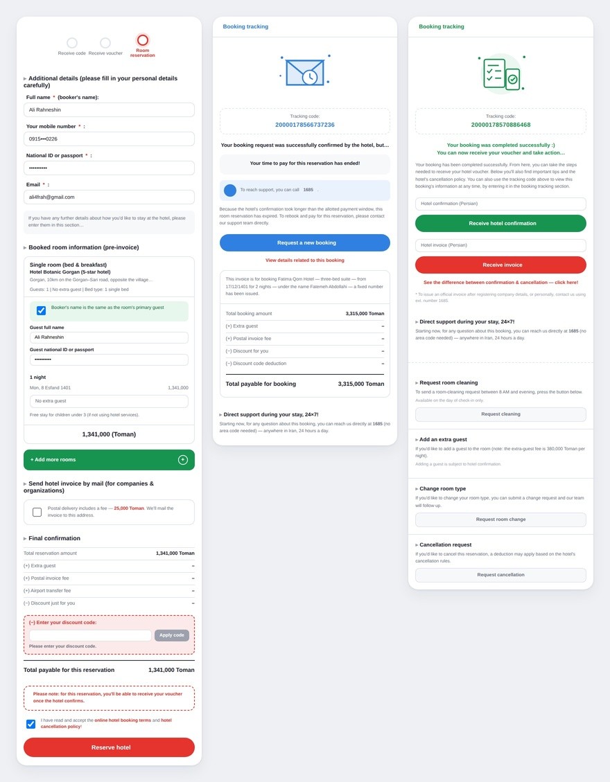
The redesign wasn't a single leap — it was a deliberate sequence of decisions. The biggest structural change was rebuilding the user flow to separate the GRS (Global Reservation System) waiting state from the main booking path, moving it to a mini-step between the payment and booking form pages. This eliminated a frustrating dead-end where users would wait on the payment screen with no visible progress or feedback.
We also consolidated all terminal states (success, failure, timeout, cancellation) onto a single final page — removing the confusion of users landing on different screens depending on the outcome.

The internet went down. I went to the airport!
In September 2022, internet disruptions across Iran made online usability testing tools completely unusable. Rather than waiting for infrastructure to recover, I copied the prototype onto my laptop and conducted gorilla testing at the airport — where real B2C users matching our persona were naturally present.
Round 1 — Hallway / Gorilla Usability Test
5 participants. 2 tasks. Task 1: book a room. Task 2: book and then add a second room.

What Failed — and What I Did About It
Finding 1 · The Calendar Was Invisible
Users knew dates were required but couldn't locate the calendar input. In my mind, it was obvious — in theirs, it blended into the page. Fix: added a grey background to the calendar component to give it visual prominence.


Finding 2 · 'Add Room' Was a Ghost
The 'Add Room' function was a small red text link — easily missed, especially on mobile. Users were creating multiple separate bookings for the same stay because they couldn't find the multi-room option. Website data confirmed this: we could see users completing duplicate reservations in the logs. Fix: replaced the link with a proper outlined button placed next to the primary 'Reserve' CTA.

Finding 3 · Users Didn't Know Booking Was Complete
After payment, users couldn't tell if their booking had gone through. This was alarming: even if revenue was secured at that point, a confused user is a user who won't return. Fix: I worked with the company illustrator to create a large, clear success illustration on the final step — visually unmistakable, no reading required. We also adjusted the primary buttons to an outline-white style so the success state dominated the screen.


Round 2 — In-Person Usability Test (Company Environment)
After iterating on all three findings, I ran a second usability test in-house to validate the fixes.

The 'Add Room' issue and booking completion confusion were fully resolved. The calendar still had a 40% failure rate — we decided to ship the current version and schedule a dedicated calendar improvement sprint rather than delay the full release.
The numbers moved — and so did team confidence.

The SUS (System Usability Scale) score doubled — from 40 (Grade F, 'Poor') in the first test to approximately 80 (Grade B, 'Good') after iteration. This is a statistically significant improvement and represents a platform that crossed from below-average to above-average usability in a single design sprint.

Additional Outcomes
The booking completion confusion was fully eliminated — 5/5 participants understood the success state after iteration.
• The 'Add Room' duplicate reservation issue was resolved — confirmed by both usability testing and a drop in duplicate bookings in platform data.
• The redesigned flow was built for both mobile and desktop, addressing the mobile-first gap identified in research.
• The Tour Reservation product was successfully shipped before peak season by leveraging internal product knowledge and targeted benchmarking — demonstrating adaptability under time pressure.
Reflection
•Earlier calendar focus: The calendar component caused the most persistent usability issue. I would prioritise a dedicated exploration of date-picking patterns — especially for RTL (right-to-left) interfaces —much earlier in the process.
• Quantitative drop-off data: I had demographic analytics but limited funnel data showing exactly where users were abandoning the booking flow. Better instrumentation before the redesign would have sharpened my hypotheses.
• B2B personas in testing: All usability tests were conducted with B2C users due to accessibility. In future, I would dedicate a separate testing session to B2B agency and corporate users, whose needs are substantially different.
• More iterations: Given more time, I would have run a third round of testing after the calendar fix — rather than making the pragmatic decision to ship and iterate.
The takeaway: Good UX design is not about having a perfect process — it's about asking the right questions, adapting when circumstances change, and measuring whether your decisions actually helped real people. This project doubled the usability score of a platform used by hundreds of thousands of users, under real constraints, with real data.
