Sustainable Awareness Built Into the Phone You Already Own

Client
FairPhone
Role
UX Design, UI, Produc Design
Duration
10 weeks
Scope
UX Research, UI Design, Usability Testing
The Brief
How do you make millions of people care about something invisible — the carbon emitted every time they use their phone?
Fairphone challenged our team to design UI interventions that raise awareness of smartphone carbon emissions. What emerged was FairHub — a first-of-its-kind section within Android Settings that connects phone usage, component health, and CO2 reduction into one coherent experience.
Starting Point — A Question Nobody Had Answered
Before sketching a single screen, I spent time
My design approach is simple: I don't design problems I don't fully understand. So before any brainstorming, I studied dozens of articles, academic papers, and seminars on smartphone carbon emissions. The research revealed something that set the entire project direction: becoming a domain expert.
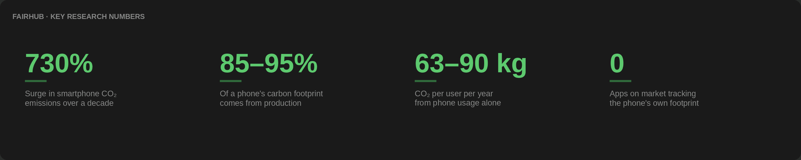
The market gap that defined FairHub:
I benchmarked every major carbon footprint application — EEvio.io, Capture, CILO.uk and others. Every single one tracked travel, food, housing, and habits. Not one tracked the device the user was holding to run the app. This was FairHub's entire reason to exist.
This domain knowledge also sharpened my ethical lens. Understanding that 85–95% of a phone's total carbon impact happens at production — not usage — meant the highest-impact design intervention wasn't about app screen time. It was about helping users keep their phone longer.

Who We Were Designing For — And Why It Changed Everything
Fairphone users aren't typical consumers. Designing for them the wrong way could do real psychological harm.
Fairphone's research team gave us three customer personas: Dark Green (activists, eco-lifestyle pioneers), Light Green (eco-active, flexitarian, daily green choices), and Bright Green (green brand buyers, less willing to sacrifice convenience). This spectrum had a crucial implication:
The insight that rewrote our entire messaging strategy:
Fairphone users already chose sustainability. They didn't buy a modular repair-it-yourself phone by accident. They are internally motivated — they need ability, not more motivation. Worse: our original fear-based, guilt-driven UX copy could trigger eco-anxiety — a clinically recognised condition that causes paralysis and avoidance when users are overloaded with environmental threat messaging.
We discovered this after consulting with external mentor Pascal, who introduced us to eco-anxiety research. It forced a complete rewrite of every line of copy in FairHub. This wasn't a cosmetic change — it was a fundamental rethink of what the product was trying to do.
03. The Decision Nobody Questioned — Except Us!
Where you place something is as important as what it does.
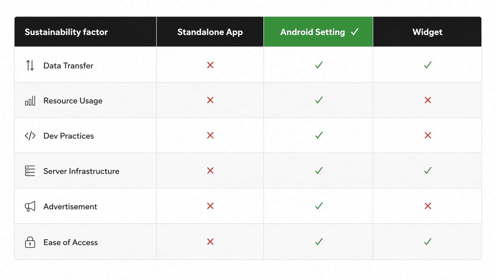
When the team discussed implementation — app, widget, or Android Settings — most leaned toward a standalone app. I found one piece of research that settled the debate:
"80% of all product-related environmental impacts are determined during the product's design phase."
Sustainable Product Policy Research
If 80% of environmental impact is locked in at design time, then building a sustainability feature inside an app —which requires its own server infrastructure, advertising model, download overhead, and constant data transfer— would contradict the very message it was trying to communicate.
04.Ideation — Stress-Testing 6 Ideas Before Committing to One
We generated 6 directions. I evaluated each one on impact, feasibility, and whether it could cause unintended harm.
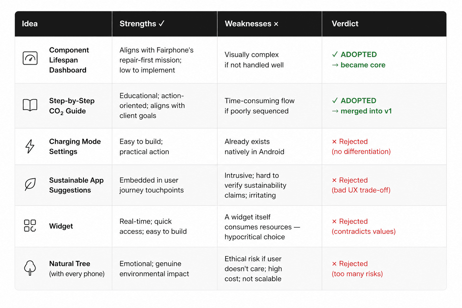
Note the Widget rejection — not because it was technically weak, but because a widget consumes resources and this would make FairHub part of the problem it was trying to solve. That kind of ethical self-awareness in design decisions is what separates a thoughtful designer from someone who just ships features.
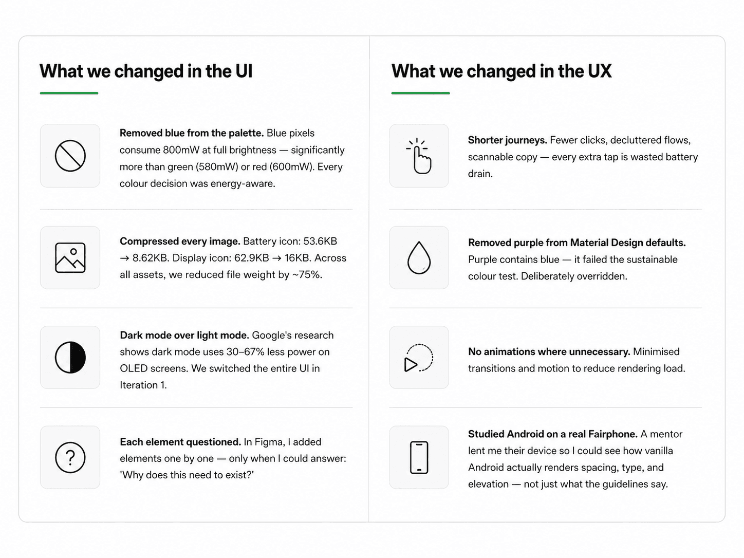
05. Sustainable UI/UX — Every Pixel Had to Justify Itself
We applied Sustainable UI/UX principles as hard constraints, not optional guidelines.
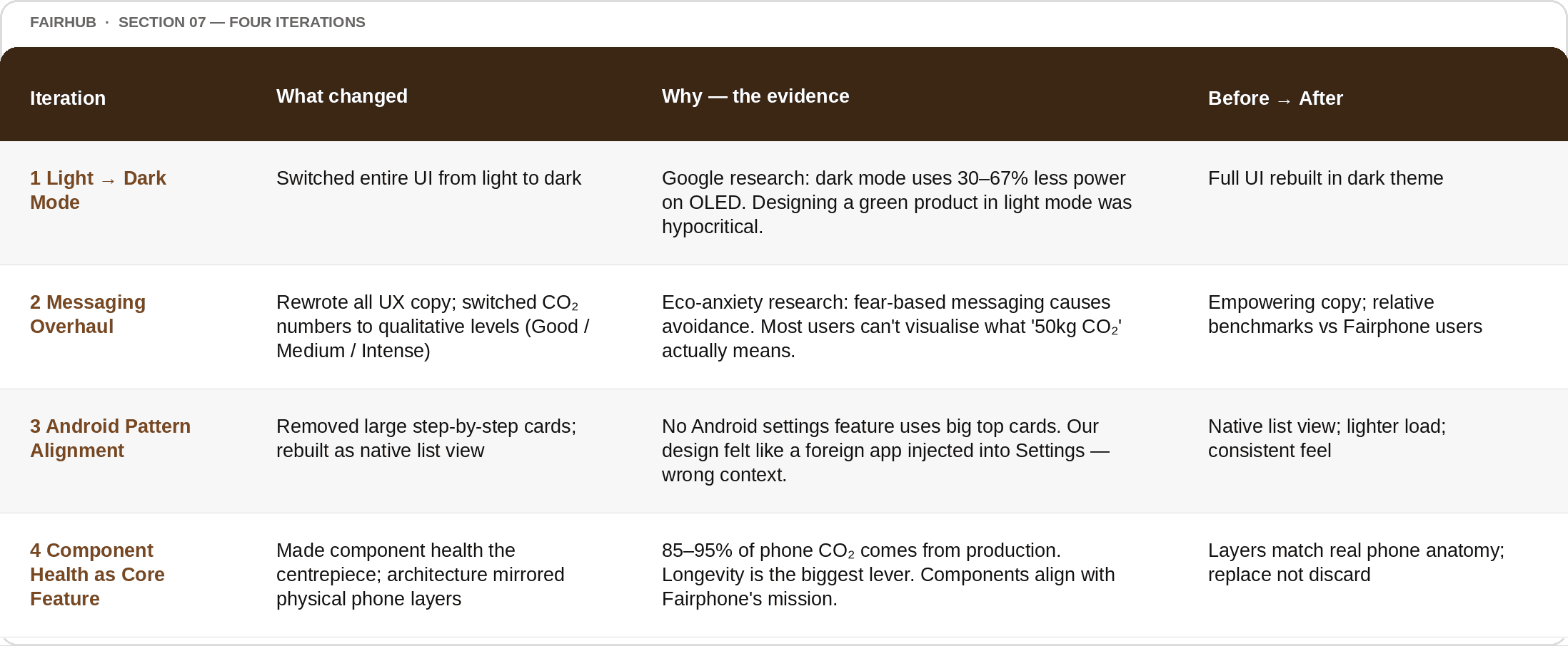
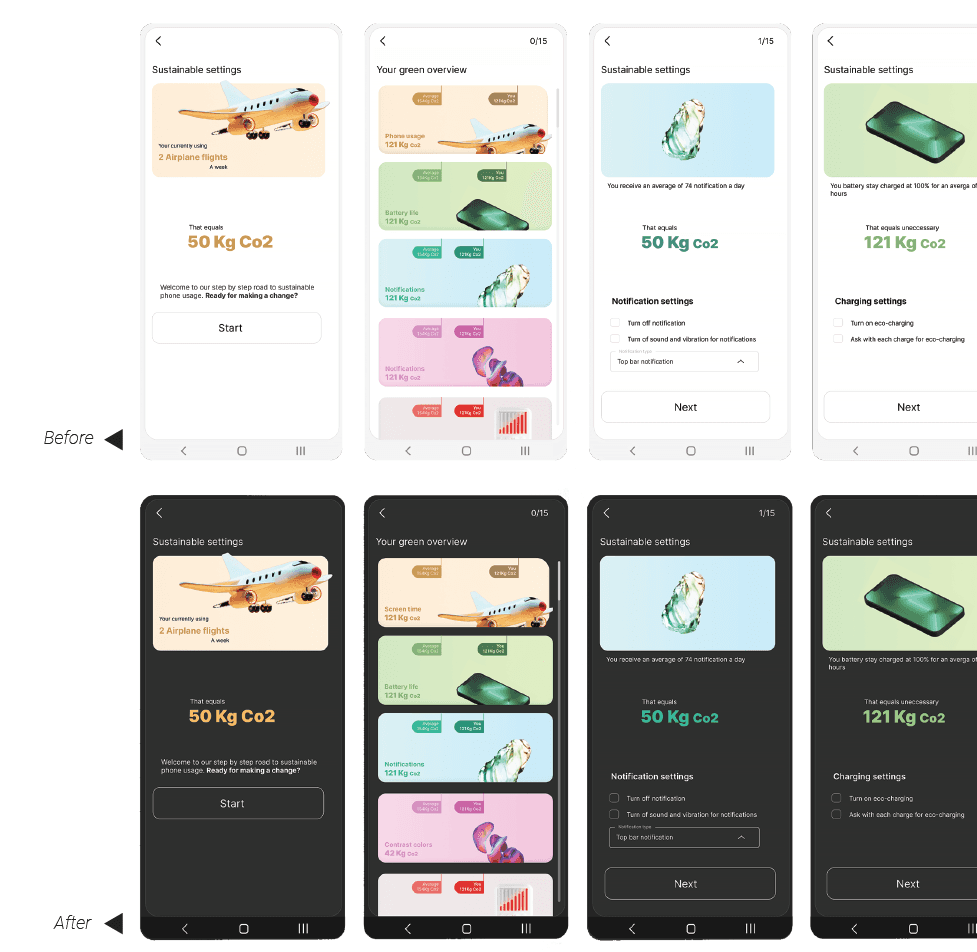
06. Four Iterations — Each One Driven by Evidence, Not Taste
This project didn't iterate to fill time. Every change had a specific trigger — research, testing, or a mentor's challenge that we couldn't ignore.
07. The Usability Lab — Eye-Tracking, Real Users, Real Findings
Most designers test with clicks and self-reported feedback. We tested with eye-tracking.
I ran the usability test in a professional lab environment equipped with eye-tracking hardware — the kind of
setup that reveals not just what users do, but where their eyes actually go. You can't fake a gaze. Users can tell you they understood something, but the heat map will tell you the truth. I also used this session to teach my teammates the full testing methodology — including the boomerang technique (reflecting questions back to prompt deeper thinking) and echo (repeating a user's last words to encourage elaboration). This wasn't just research. It was mentorship inside a live test.
WHAT THE EYE-TRACKING REVEALED
The heat maps told us three things our usability tasks almost missed:
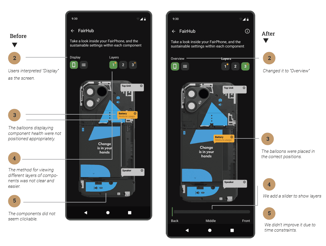
1. Users' eyes went straight to the component health balloons — but the balloons were positioned in the wrong places. Gaze data showed participants fixating on areas that didn't correspond to the actual component being labelled. We repositioned all balloons to map precisely onto the physical component locations in the device image.
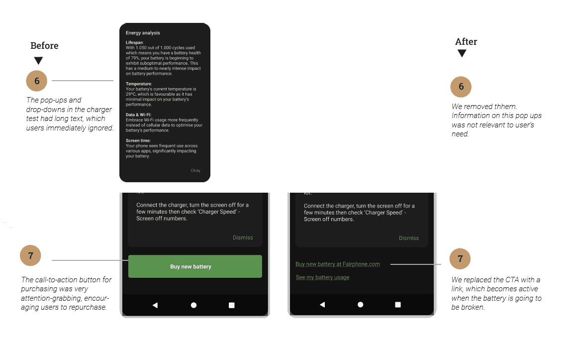
2. The 'Buy new battery' CTA captured disproportionate eye attention — drawing gaze even before users had finished reading the battery health information. A prominent purchase button on a sustainability tool that encourages repair was sending the wrong signal entirely. We replaced it with a contextual link, activated only when battery health actually warrants replacement.
3. Layer navigation received almost zero fixation — because it didn't look interactive. Users scrolled past the component layers without realising they could navigate between them. We added a physical slider (Back / Middle / Front) that made the depth navigation visually obvious.

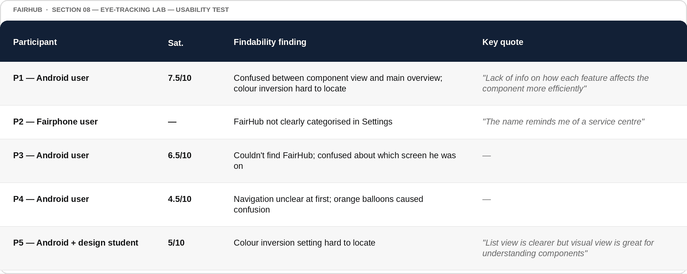
Test Goals & Participant Overview
We tested 5 participants across findability, learnability, satisfaction, errors, and efficiency — deliberately including one actual Fairphone user to compare against standard Android users.
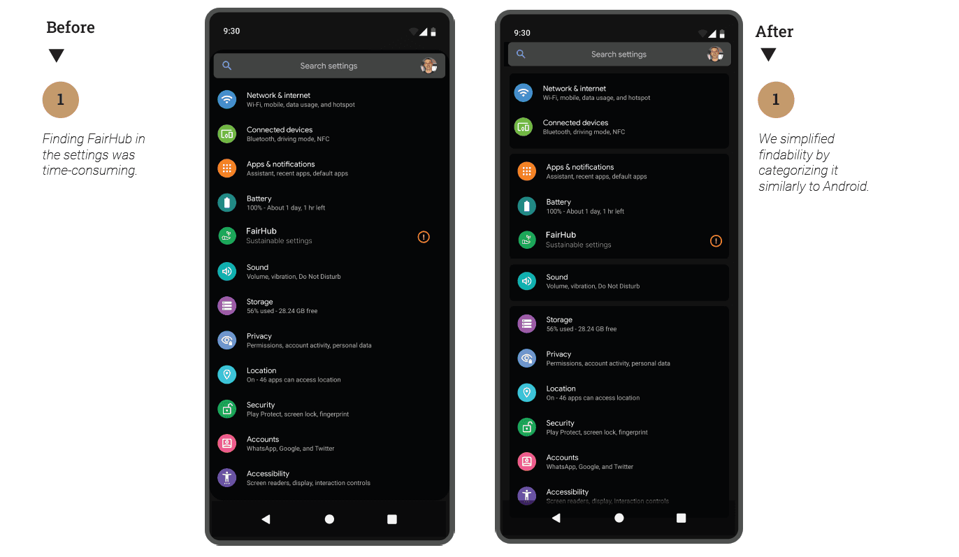
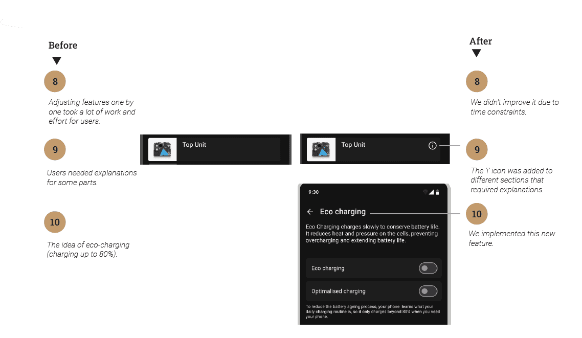
08. 10 Findings ® Solutions — Shipped vs. Deferred (and Why)
We found 10 issues. I want to be clear about what we fixed, what we didn't, and why — because honest documentation of limitations is part of good design.
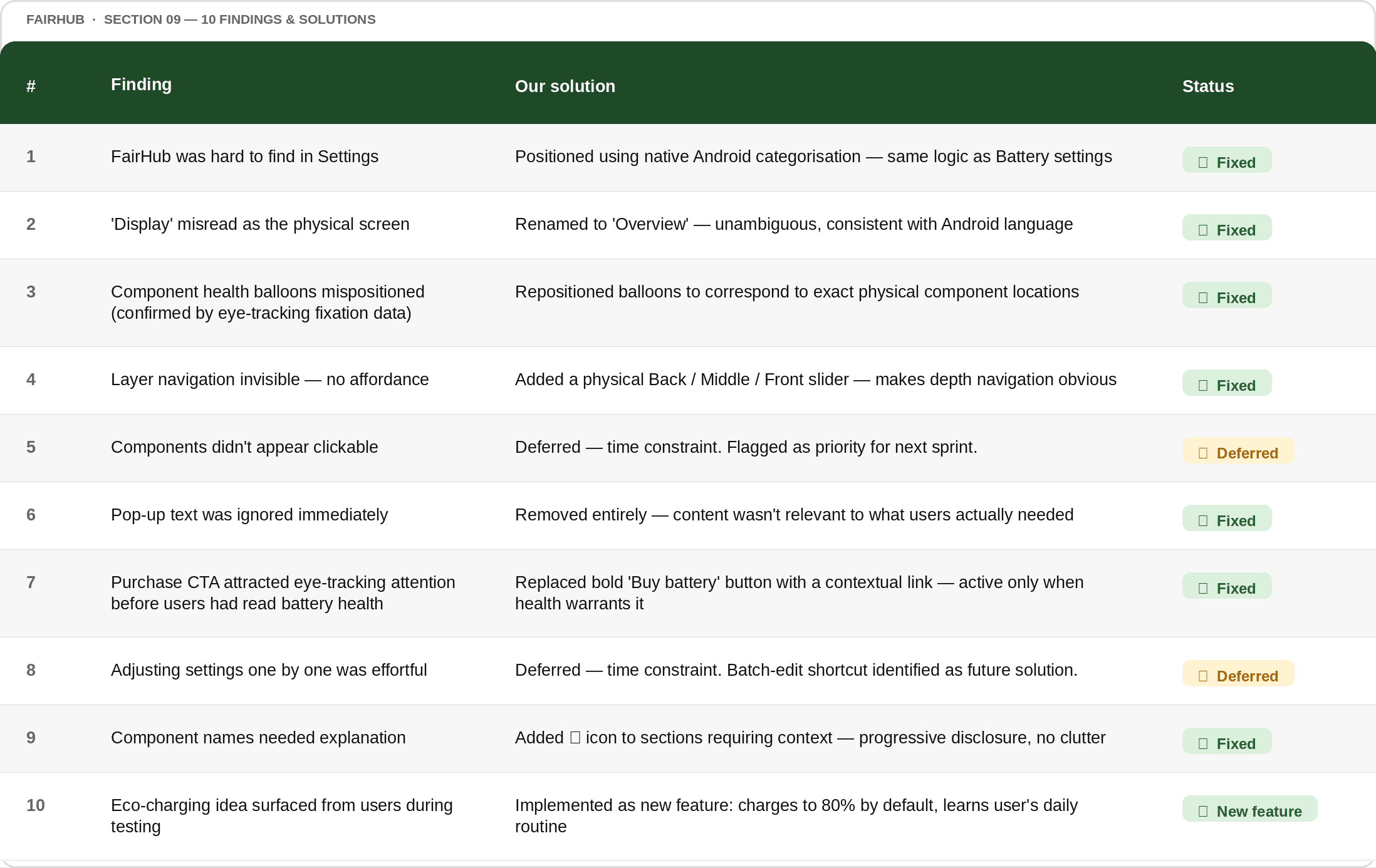
Note: Findings 5 and 8 were deferred due to time constraints. I documented this explicitly — including the acknowledgement that our solutions are not necessarily correct and might create new problems. We also noted that only one participant was an actual Fairphone user, which could affect generalisation of results. A designer who documents limitations is more trustworthy than one who doesn't.
What FairHub actually taught me:
Design is not neutral. Every colour uses energy. Every animation costs battery. Every pop-up that users ignore is wasted data. Every fear-based message that causes eco-anxiety is a harm your product is causing. The best sustainable design decision we made wasn't about the colour palette or the dark mode — it was choosing to build FairHub inside Android Settings, where it required no download, no server, no ad model, and no extra footprint. Eye-tracking showed us truths that self-reported feedback never would have. Gaze doesn't lie. Buttons that capture attention before context is read are design failures, even if users never mention them in interviews. That is what lab testing — real lab testing — gives you.
